
Japan / 2024—2025
A world
in full colour.
A visual language of waves, sakura
and movement, across two editions.
- Role
- Branding, key visuals & full creative direction
- 2024
- Japan FinTech Festival
- 2025
- GFTN Forum Japan
01 / Creative direction
A local expression.
A connected world.
I led the branding, key visuals and creative direction for both Japan editions.
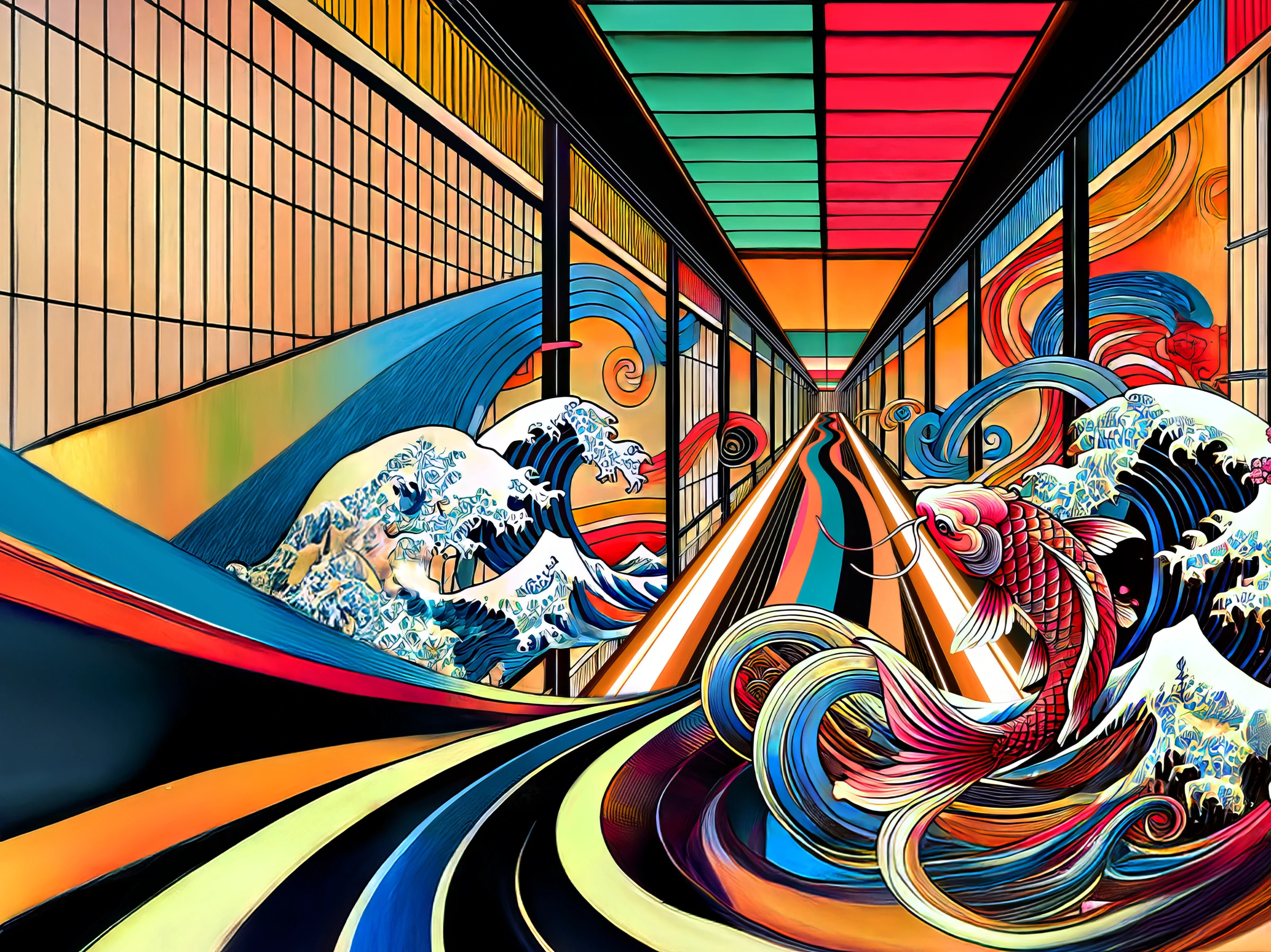
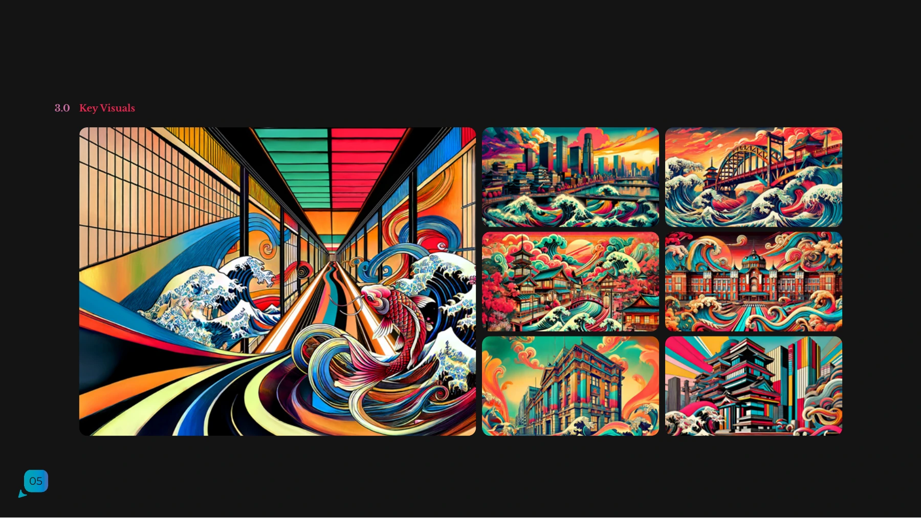
The visual language brings together Japanese cultural motifs and a vivid sense of movement. Sakura, waves and flowing colour form a shared vocabulary, with a distinct composition for each year.
The 2025 identity carries that language into GFTN Forum Japan, retaining the sakura pink while introducing the GFTN logo and a wider family of key visuals.
Japan FinTech Festival
2024 / Key visual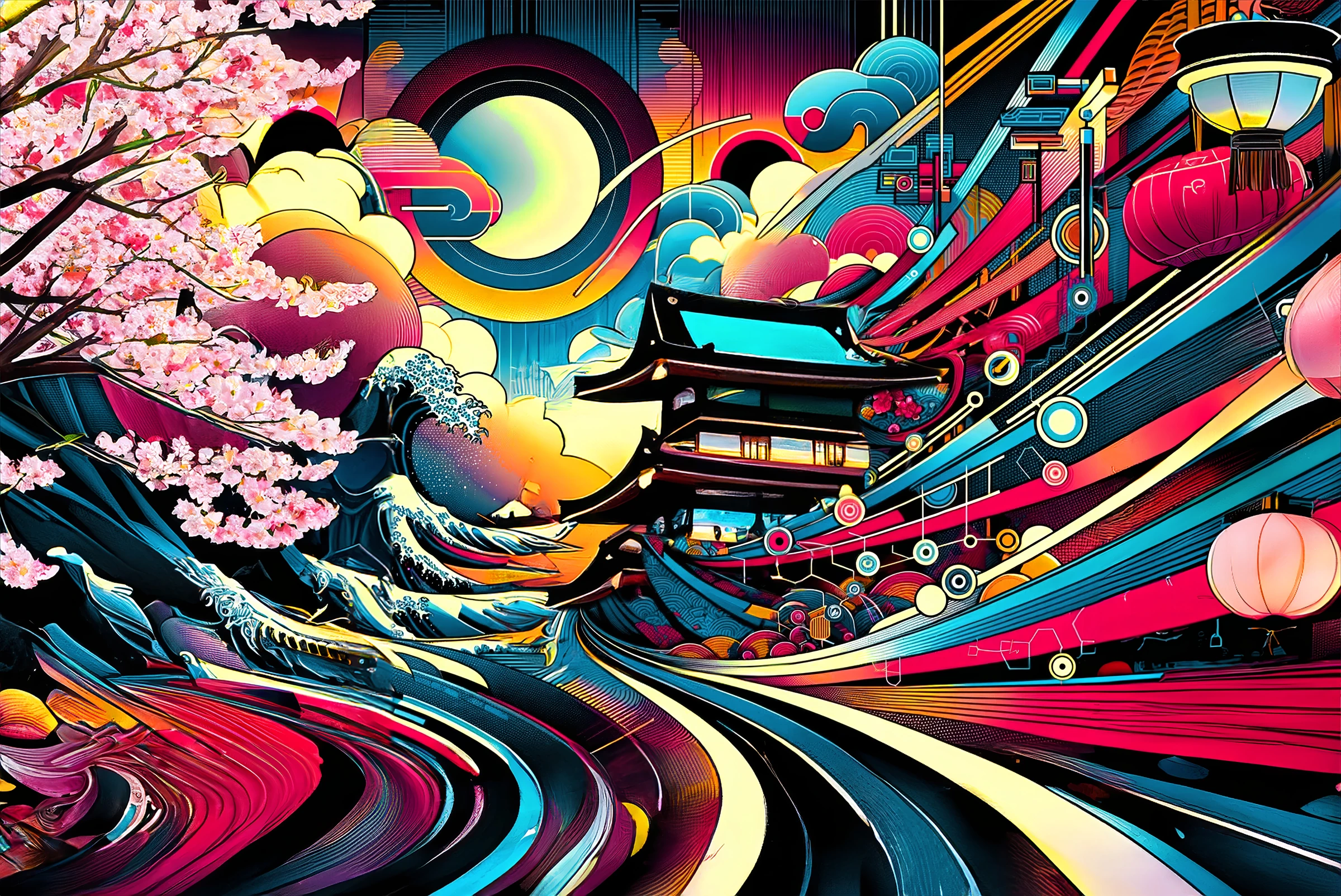
The brand system
Selected brandbook excerptsJapan FinTech Festival 2024 / January 2024
Branding, key visuals & full creative direction by Syahkeer Rodrigues
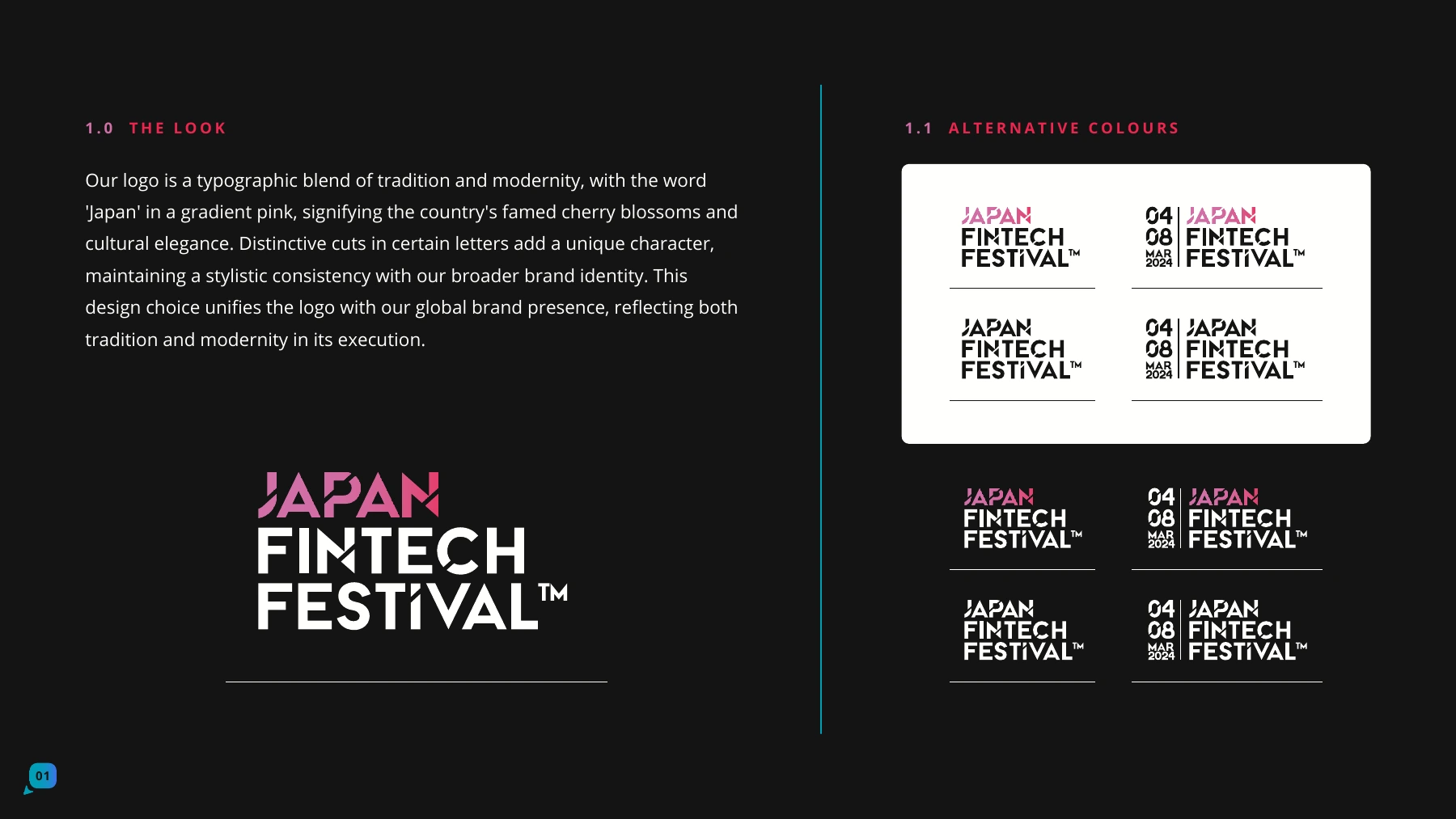
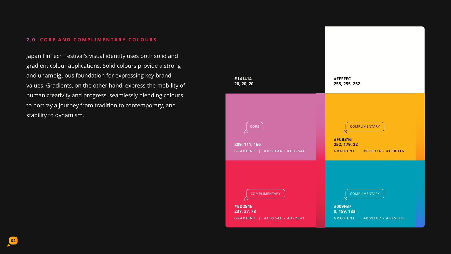
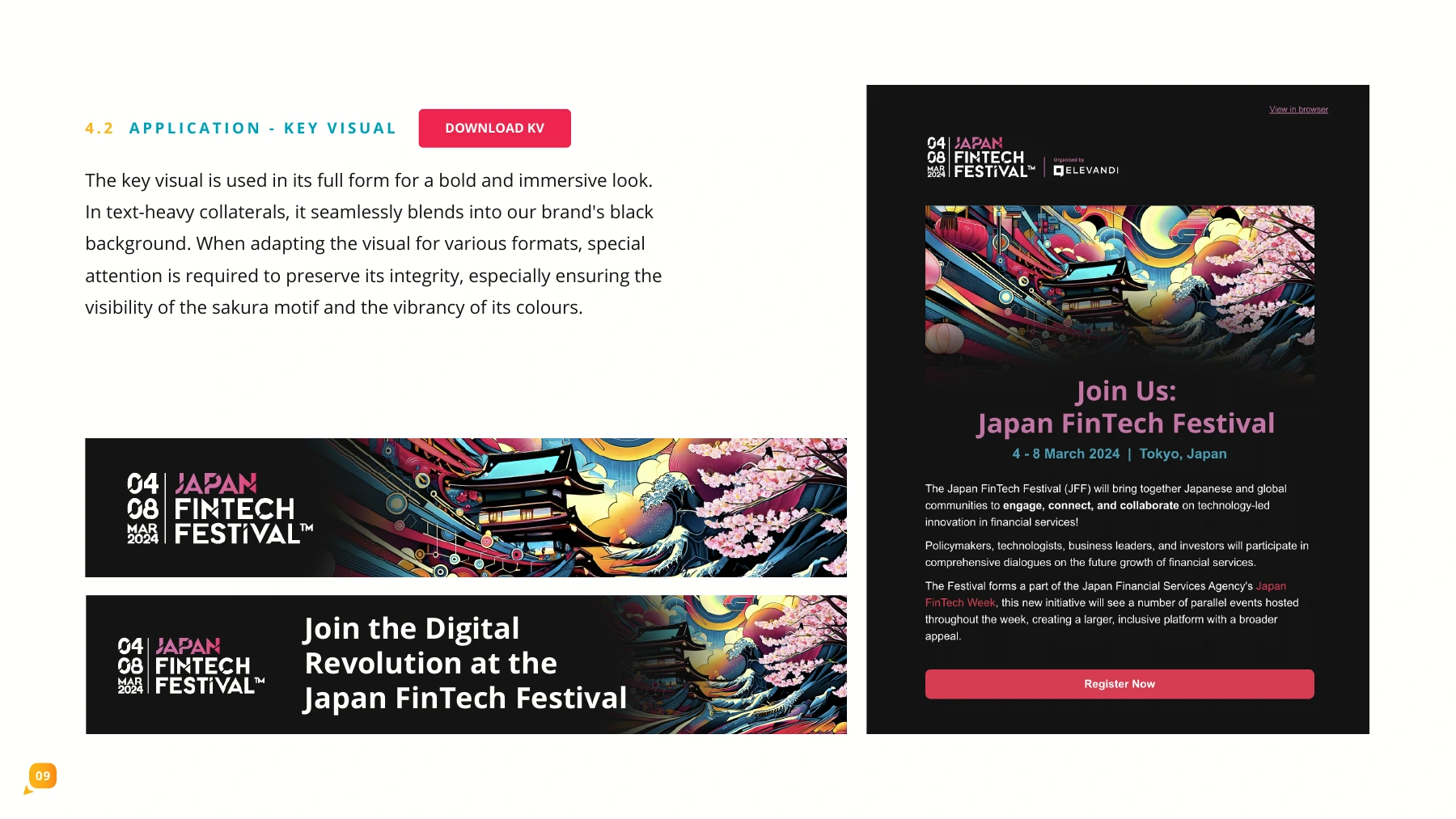
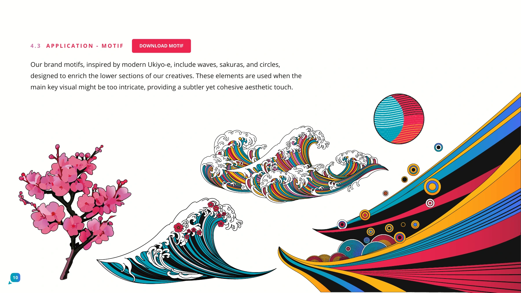
Selected pages from the dated brand guidelines.
GFTN Forum Japan
2025 / Key visual familyThe corridor and koi composition leads a family of related visuals, carried through the identity and campaign applications.
The brand system
Selected brandbook excerptsGFTN Forum Japan 2025 / February 2025
Branding, key visuals & full creative direction by Syahkeer Rodrigues
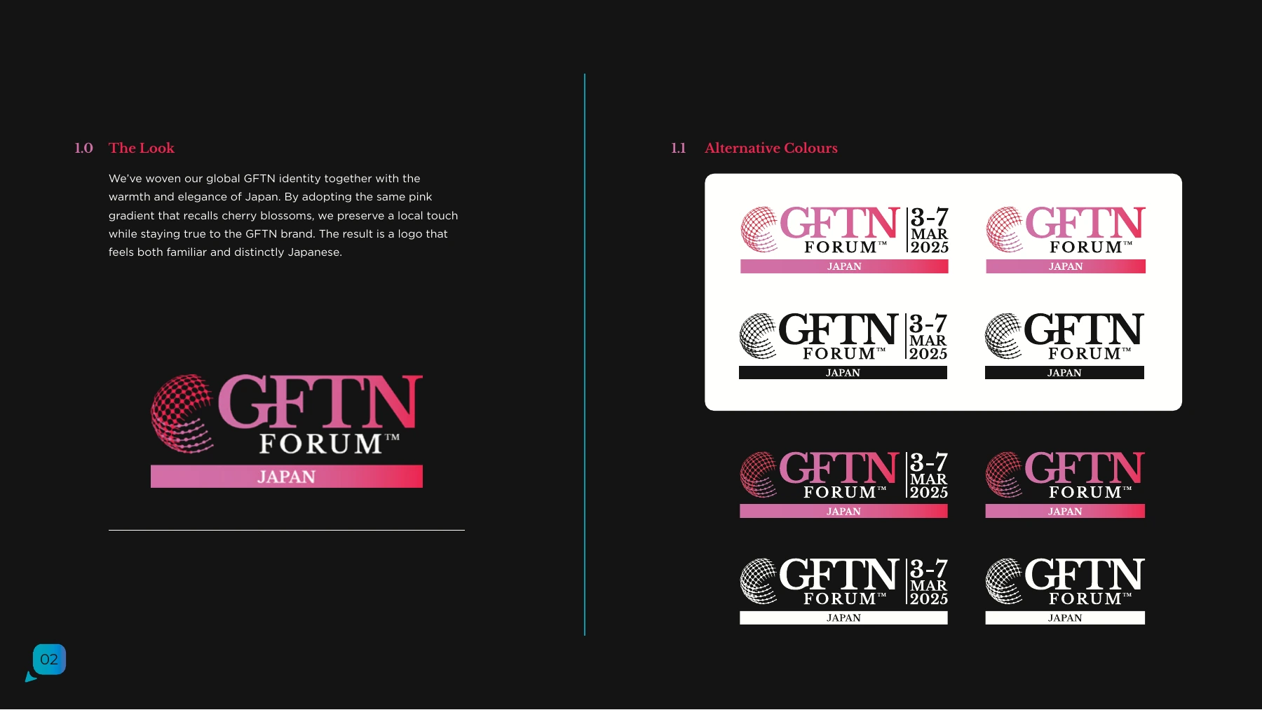
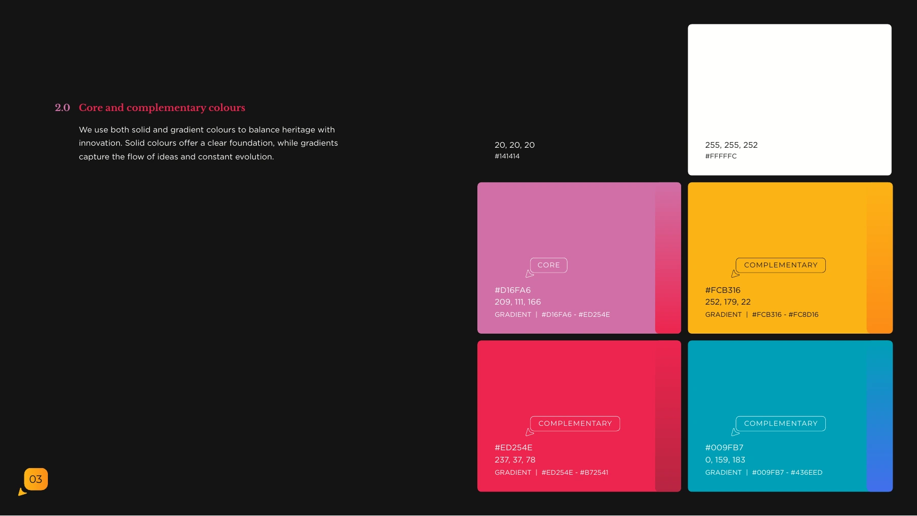
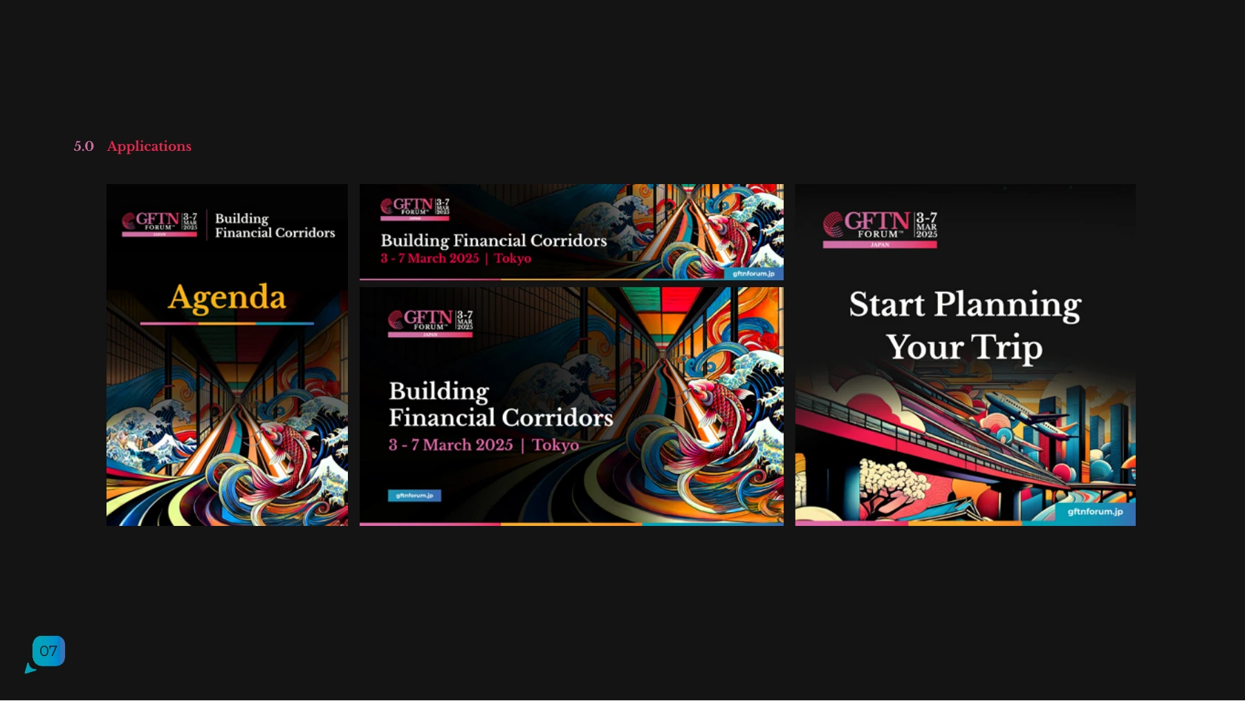
Selected pages from the dated brand guidelines.
Continue exploring
Back to selected work Discuss a creative direction project →